Wednesday, October 27, 2010

Facebook (1) | Hot Sales: 2010 Jordan Heels Boots Edition...Sexy Kicks!!

Fresh off of Facebook, as forwarded to me by my muse who obviously felt this was "blog-worthy" ( AND YES! IT IS!!!!).....


This is such an interesting concept to me....As a HUGE boot fan, ( and those of you know me, KNOW I am not evennnn lying about my boot fetish!!!!), and, as a student at UC Davis, I have often been at the mercy of miles of campus to cover while painfully hobbling in 4-inch heels.. Fashion before function, I always say....:)

But really, the cozy combination of tennis shoes ( which I NEVER wear because they are not my idea of "fashion") and boots (sexy sexy) is a lil bit tempting.  I will probably never wear them because my fear of ugly tennis shoes is too intense, buuuuut, these urban kicks really do deserve a look at.  Really, can't you just see someone super-hot like Rihanna TOTALLY rocking these out????

What surprised me was, upon research, it seems to me that none other than Christian Louboutain collaborated on these with Nike...

Christian Louboutain.

The Angel of Footwear.

See????


airjordanheels.com

airjordanheels.com

airjordanheels.com

airjordanheels.com

airjordanheels.com

Reallly????

Check this out:
http://www.airjordanheels.com/air-jordan-13-high-heels-c-4.html

and, for one of the FUNNEST websites I have visited in the past few weeks, Christian Louboutain's website:

http://www.christianlouboutin.com/#/intro

I am still, as we speak, trying to dig into the complete factual information of how the idea gave fruit to conception  which gave fruit to exploration which gave fruit to presentation which gave fruit to approval which gave fruit to production.  But, time is racing and this chic's blog will turn into a pumpkin at midnight.  Which, by the way, the pumpkin IS a fruit....

In the meantime, YOUR vote???? Do ya think they're sexy??????

Facebook (1) Hot Sales: 2010 Jordan Heels Boots Edition...Sexy Kicks!!: "2010 Jordan Heels Boots Edition"

Matthew Williamson, Jim Lambie and Musing....

Musing...not just pondering over life and whatnots, but MUSING- the instantaneous and immediate sense of "AHA!!!!!" that you get when you see something, or hear something -( not just something, ANYTHING AND/OR EVERYTHING)- and you are just absolutely overwhelmed with the need to share, to create, to write to sing to dance to laugh.  Or should I say 'musED", not "musING"?  Let's see.....hmmmmmmm.... you are a muse if YOU inspire someone, MUSED if someone inspires YOU....perhaps MUSING is when it is a mutual and reciprocal relationship of inspiring back and forth....a collaboration and sharing of ideas and skill that just leads to more and more amazing concepts and production. 

I am extremely blessed to be continually mused, not just by someone historical or famous or distant, but by someone important and very close to me in my life. His eye for beauty and design and knowledge as well as the read and the written word leave me striving and aspiring to keep up. But that is not to say that I am not in complete reverential awe of, and mused by, designers of every walk and calling in this world who have paved ,or are paving a new path, through the sea of design talent that ebbs and flows all around us.

One such person is Matthew Williamson, British designer extraordinaire.  He inspires me.  Be inspired as well....

http://www.matthewwilliamson.com/

What a relief to know that someone who has such amazing and notable talent ( virtually King of London Fashion Week 2010) is also mused.

He states in an interview that he is inspired by installation artist Jim Lambie, which, of course, led me to Lambie's website....

http://www.webexhibits.org/colorart/lambie.html

What struck me, first, was the color.  Bright and vivid and bold, the color combinations remind me of ancient Najavo or Aztec weavings.  Sunny, frenetic, bright......energy zipping madly about in a very geometric and rectilinear fashion.


Both designers- one fashion, one artistic-amaze me and muse me to be more.  To do more. 

Who muses YOU?  More importantly, what are YOU doing to muse someone else?............
Jim Lambie, Touch Zobop(2003)

The patterns themselves are straightforward- vinyl tape covering every inch of surface and each pattern an installation as unique as the museum its exhibited in.  Not one piece can every be duplicated as each location is architecturally different.

The constant zig-zagging in and around these architecturally different features is almost Op Art in it's effect. The equal, linear proportions coupled with equally intense hues insures that our eyes will constantly jump throughout the installation. 


Jim Lambie, MoMA

There is no focal point, rather, the geometric and repetitious continuity of color and line LEADS our eyes somewhere.  Where?  I am not sure, but I do know that my eyes chase madly around, never resting.  The energy from this movement actually physically makes me tired, as if I am racing, all colorful and bright, around the room, over and over and over again.

Westwood & Williamson shine at London Fashion Week

Now into my third week guest teaching, again, Fashion Design at Vacaville High by request of Patti Taylor, a UC Davis alumni, my favorite part of the whole experience is interacting with these young, blossoming teenage girls who are just trying to make their way through the day and figure out what the heck they're going to wear....let alone who they are becoming or what they are going to be one day.


When I informed them that I was sorry to say,but, the word on the street was that skinny jeans are OUT- which very much represented the current and past year's trends from the 80s- and that bootleg and flares will be coming back IN, the protest was LOUD & CLEAR...."EWWWWWW!!!" "NO WAYYYY!!!" "I AM NEVERRR GOING TO STOP WEARING SKINNY JEANS!!!"

Did I once say that at the precocious age of 17????

Laughing, I told them, "Don't worry, you live in Vacaville...this means that it will take about a year for it to catch on"....I am not quite sure if they could decide if it was a relief or an insult.....and I am STILL definitely laughing about that.

What is coming our way, like it or not - (I DO)-, is a return to the prettier side of the 70s. Soft flowing pastel fabric, soft pastel and muted shades and metallics. Lots and lots of metallics. Beading on jackets, shirts, purses. Oh, and fringe. Yes, fringe. My least favorite trend.

But, what I love about design, and not just fashion, is that it always takes inspiration from something that was once original and makes it what is very au currant...very NOW. In fashion, we have seen every extreme there can be from the longest length skirt to the shortest mini....from the corsets of the baroque period to the oversized caftans of the 60s...and on and on and on...THERE IS NOTHING NEW UNDER THE SUN. Or, in the case of fashion, under the sewing machines. Here's a peek at the 70's...


http://www.youtube.com/watch?v=0I8JtfMdCpg


http://www.disco-disco.com/disco/clothing-pics.shtml


What we can do is give it a fresh color palette. We can adapt a look, not in its entirety, but an element that is flattering. We can mix and match it with what is already currently being worn and integrate it into a combination of looks that have never been explored....More importantly, we can take the sleek look of a metallic disco dress and make it out of a better fabric. Dresses- actually almost EVERYTHING except maybe underwear..... Wait, no, EVEN underwear- were made of polyester. Polyester, for those who don't know, is made of synthesized polymers...completely plastic, practically, and when you sweat in it??? Funky.
Those of you who also grew up in the 70s feel my pain.


Here is a wonderful example, a clip of London Fashion Weekoff of YouTube, that gives a quick 2 minute and 53 second look at what was being projected for Spring/Summer 2011. Featuring 2 of my favorite designers, (which I will blog about also), Vivienne Westwood and Matthew Williamson.
Look out, Vacaville High School...:)


Vacaville High School.....LOOK OUT!!! :)

Monday, October 18, 2010

Gap logo Before, After, and Before.....

Geeky Math Equation Creates Beautiful 3-D World | Wired Science | Wired.com

Because I am somewhat of a Sci-Fi geek, ( YES, I DID see Star Wars, the ORIGINAL, at least 5 times, in the 70s and wanted to marry Hans Solo), I have "Wired" website in my Favorite queue on my computer so that I stay somewhat informed of what's new in the electronics and sci-fi realm.  Most of the time, the articles go above and beyond my right-brained sensibilities.  But SOMETIMES I get lucky enough to stumble upon an article like the one I saw this morning.

It was the photograph that took my breath away.  The continuity of line and form- the repetition of pattern that has no beginning or no end- is hypnotizing.  All the nooks and crannies and intricate details made me curious as to just WHO designed this piece.  And then I read the article.  It was a 3-D example of a logarithm.  A LOGARITHM.  A LOGARITHM?!?!?!?!?!?!......

For those of you who don't know:


The Definition of a Logarithm:  a logarithm is an exponent

A logarithm is an exponent.

For those of you who are visual, like I am:

y = logbx if and only if by = x,
where x > 0, b > 0, and b [not equal] 1.
For those of you SICK enough to dive further:

http://www.andrews.edu/~calkins/math/webtexts/numb17.htm#DEF

ARE YOU KIDDING ME??? Math????

We have been discussing the multiple definitions of design in Dr. Housefield's Design 001 class, and it has been brought to our attention that nature is one thing that in non-design ( although I like to call it God's design, I can neither prove it or argue it, nor do I want to so here): nature is not conceived or planned by man, nor produced by man. BUT, nature, science, and EVEN math CAN inspire us.
Math has long since been in existence since ancient Greece in explaining the mechanics of the universe and physics at large. The answers, satisfying when seen in mathematical equations, are as stimulating to some as the visual equivalent of mathematics DESIGNED......


Geeky Math Equation Creates Beautiful 3-D World Wired Science Wired.com: "Geeky Math Equation Creates Beautiful 3-D World
By Alexis Madrigal December 9, 2009 8:00 pm Categories: Brains and Behavior, Physics


Editor’s note: We are rerunning this gallery of 3-D images inspired by the work of Benoit Mendelbrot, who is best known for popularizing fractal mechanics. Mandelbrot died Oct. 14, 2010, at the age of 85.
The quest by a group of math geeks to create a three-dimensional analogue for the mesmerizing Mandelbrot fractal has ended in success.
They call it the Mandelbulb. The 3-D renderings were generated by applying an iterative algorithm to a sphere. The same calculation is applied over and over to the sphere’s points in three dimensions. In spirit, that’s similar to how the original 2-D Mandelbrot set generates its infinite and self-repeating complexity.
If you were ever mesmerized by the Mandelbrot screen saver, the following images are worth a look. Each photo is a zoom on one of these Mandelbulbs.
Also, see our gallery of fractals in nature.

http://www.wired.com/wiredscience/2009/12/mandelbulb-gallery
Please, please, please go to Wired and look at the entire gallery, and you too will see that Math, Science, Art and Design CAN go hand-in-hand....

Saturday, October 16, 2010

My Conversation with Marina Abramovic...

Walking across campus today, I was truly annoyed and disgusted. While a car was trying to turn a corner, their light green, a million bikers and pedestrians continued through, against the light, oblivious to another human being trying to do what needed to be done to get them from Point A to Point B....what happened to all the lessons we learned in Kindergarten about sharing and taking turns and treating others the way we want to be treated?...where did we lose that?

Perhaps it wasn't just the selfishness on campus that was laying underneath my skin. Perhaps it was the video clip I had just witnessed in my Design 001 class prior to the Great Intersection Debacle.
Posted on the New York times website, artist Marina Abramovic was being interviewed. A Serbian artist, Marina explores relationships between the audience and the performer.  Raised by conservative perents in a time of revolt and revolution, Marina first discovered that she enjoyed performing and the reactions that followed when, as a young girl, she would create fake explosions to see the recation of her neighbors.  While living at home under strict, military-like conditions and rules, Marina was peforming acts of cutting herself, burning herself, whipping herself, all before her curfew of 10 PM.  


Her first performance piece, Rhythm 10, was performed in 1973, where Marina cut herself.  Following that, Rhythym 5, Rythym 2, then Rythym 0, all performance pieces where Marina subjects herself to pain, all while testing her and her audience limits.

With her work featured in London and in New York, Abromovic had recently finished a show, the highlights of which we witnessed. My question, after watching the clip was "Is that art? Design? WHAT ARE YOU TRYING TO SAY TO US MARINA?!?!?!?!!?"

With a warning that viewers may object to the controversial subject matter, it only got worse from there. While explaining her installation , "Rythm 0", and seeing on a table behind her a row of scalpels and knives, my stomach turned. According to Abramovic, the instillation was planned so as to involve the viewers into a very private view of her cutting herself with various knives, to the same rhythm each time, in the same place, while accompanied by a sound recorder so you could hear the flesh being cut. And that was only half of it...

http://www.youtube.com/watch?v=ennfeVSirDU


<object width="480" height="385"><param name="movie" value="http://www.youtube.com/v/ennfeVSirDU?fs=1&amp;hl=en_US"></param><param name="allowFullScreen" value="true"></param><param name="allowscriptaccess" value="always"></param><embed src="http://www.youtube.com/v/ennfeVSirDU?fs=1&amp;hl=en_US" type="application/x-shockwave-flash" allowscriptaccess="always" allowfullscreen="true" width="480" height="385"></embed></object>


Is this Art? Perhaps. To me it wasn't so much as Abramovic creating, with mediums, a conversation between artist and public, but rather her, the performing artist, to let the public dictate to HER what they were feeling and capable of when "no holds barred".


I can say with certainty that it certainly isn't design. Design solves a problem while working within boundaries and serves a higher purpose of raising the aesthetic value of our lives whether it be the furniture we sit on, the dishes our toast sits on or the New York Times paper we have spread open before us at breakfast.

In The Design Process by Karl Asperlnd, he lays out these 7 steps:
Inspiration
Identification
Conceptualization
Exploration
Definition
Communication
Production


Did Abramovic installation piece have Inspiration? From somewhere, I suppose. She quotes in the posted clip that " people see themselves in me. they face their fears." in reference to her second piece in which gallery attendees are invited to take instruments of torture and pain of their choice and inflict pain on her somehow, anywhere. any how. Down to the point of picking up a gun, which contained one single bullet in it, and shoot her. Where was her inspiration for allowing pain to be inflicted on her?

Identification? yes, she knew exactly how she wanted to engage her viewers but at what point did I, as the viewer, identify with her and relate to her artistic communication? In no way shape or form was I facing any personal fear because I do not surround myself with people who would hurt me and in no way am I going to suppose that random acts of violence will occur to me in my lifetime. Yes, rape and murder and robbery exists but I take the steps necessary to avoid the potential of such happening. And do I identify with the audience- the attendees- who are willing participants in this grotesque proof of the sickness of humanity, when, upon seeing the invitation to inflict pain upon Marina, gladly took part...

"A man pressed the gun hard against my temple. I could feel his intent. And I heard the women telling the men what to do. The worst was the one man who was there always, just breathing. This, for me, was the most frightening thing. After the performance, I have one streak of white hair on my head. I cannot get rid of the feeling of fear for a long time. Because of this performance, I know where to draw the line so as not to put myself at such risk." M. Abromovic, The Observer,
http://www.guardian.co.uk/artanddesign/2010/oct/03/interview-marina-abramovic-performance-artist


No. NO and HELL NO.

Conceptualization? I am sure the piece means something to her, as an artist, so as she was forming the concept of a dialogue between herself and the viewer, she had to be choosing in what way shape and form that this conversation would take place.


Exploration...was this an exploration of humanity and the depravity of the human spirit? an exploration of how far an artist has to go to gain attention in the over-saturation of talented and unknown artists, doing whatever it takes to get their " 5 minutes of fame"???


The Definition of this project was strong and precise in the first installation where she videotaped her cutting herself within definite parameters of how, when, where. But the second installation of where she allowed the public to inflict pain on her was only defined in the instruments that she chose to lay on the table . What happened then was wide open and rightfully scary.


Communication. I have always felt that communication should be a positive experience of sharing or learning- a space in time where there is room left to grow from new information and insight and to reshape values or thoughts based on such. Positive growth. What Marina speaks to me, again, is not reflective of my own thoughts and fears, as she so states, but instead, what I am HEARING is something so sick and disgusting about humanity- that a large group of random people- not criminals, not convicted felons- EVERYDAY people would so eagerly jump on this opportunity to do so....Perhaps what she really is saying to me exactly that, although it belies her statement of it being a reflection of the viewer getting over and facing their worst fears. Perhaps our worst fear is that WE have it within ourselves to be violent and inflict pain on others and just WHAT will it take to make us feel comfortable enough to do so? THERE, perhaps, THAT may be the important message that Marina wants to communicate so badly that she allows herself to be mutilated publicly.

Production and the performance of this piece, again, breaches boundaries of preceding installations where, at one time, nudity and artistic sexual acts where controversial. This willingness for the gallery and the artist to go this far in making an artistic point and dialoguing in such morbid manner was a huge risk. What IF Marina really got hurt? Maimed beyond recognition? Shot and killed? How far are we willing to go, as artists, to say what it is we are trying to say? It is a question that I am unable to answer.


The pedestrians finish crossing the street at the light and the car is finally allowed to turn but only after the light has changed twice now. People everywhere around the world are crossing streets and trying to make right hand turns and the humanity continues to exist, day-in and day-out. And underneath it all, the sick feeling that perhaps Marina really did tell me something in that conversation that maybe I really didn’t want to know.....
So, if "Rythm 0" was not design, although the situation was conceived and planned out, and it wasn't art as we- the typical public- know and enjoy it....what WAS Marina doing? She was talking to us, revealing to us what she already knew about humanity and their capacity to hurt when there are no limitations. And the public talked to her, angry and violent and mean words that YES, she was right all along.

Wednesday, October 13, 2010

Michael Beirut and Design, described in simple terms....

"Graphic design is almost always about something else..."
"Not everything is design. But design is about everything..."
"And graphic design wasn't enough.  It never is..."


http://observatory.designobserver.com/entry.html?entry=4137

These three quotes, (found in the article above " Michael Beirut's WARNING: May Contain Non-Design Content', Design Observer,  March 2006), are three of my favorite quotes on design I have ever heard and succinctly sums up the millions of odds and ends rattling around my conscious and subconscious in regards to "WHAT is design???"

And that is the question that is asked of me, by friends and family wanting to know what being a "Design" major means..."Fashion?" "Interior??", "Graphics???"...Yes, yes, yes, and so much more.

Design IS about everything and all around you all at once....when well done, it is above and beyond as even being recognized or, sadly, even noticed.  The line of a car...

2003 BMW Z4


the detailing of a shoe...


a retail store...

Me & Prada, doing Las Vegas...

and even the shopping bag that your goodies come in.....

Michael Beirut for Pentagram, Saks Fifth Avenue


We know what is beautiful when we see it, but do we appreciate the work that good design does for the product and for us, as well? Design should not only be pleasing to our senses of sight or touch, it should also have function that communicates...a language between the designer and observer.

"Touch me", a sofa might say, with a luxurious fabric and color that begs to be sat upon....but, what if the cushions are as hard as a rock?  That is form without function.  A hospital mural in a Pediatric wing that contains Boticelli-esque nudes? Or even a coffee cup made of material so biodegradable that, after 5 minutes in a cup, the liquid inside burns off at least two layers of your derma? BAD DESIGN.

But, on the other hand, good design not only serves a purpose, but is pleasing....my favorite current example of good design????

New Apple iphone 4G, my love..


It's not only appealing physically, the functions on this phone are above and beyond normal cell phone functions: the epitome of doing everything but making me my morning coffee.  GOOD design.

Why bring up Michael Beirut? Not only has he been a continual focus in my Design 001 class with Dr. Housefield this quarter at UC Davis, Beirut is also within the pages of my required Lauer "Design Basics" text....BUT.....

...upon preparing to blog and googling for images, I discovered thast Michael Beirut is a huge part of the Pentagram design team.  The pinnacle of my existence as a future designer.  The holy grail of design work.
The alpha and omega of what a good design firm can and should accomplish.

Pentagram, on a quick tangent, is a design firm that started in 1972 in London, England and has since expanded to New York, San Francisco, Austin and Berlin.  It is not enough for me to tell you that they handle commercial, interior, sustainable, graphic, architectural and industrial design, so I invite you to take a peek....

http://www.pentagram.com/en/

and here are some of Michael's accomplishments outside the Pentagram arena...


poster forYale School of Architecture,
designed in Bantjes' calligraphy, representing the Rococco period

Core 77's font/logo

in designobserver.....

Respectfully yours,

nadja

Monday, October 11, 2010

Fashion Design , 101.......

Excited and Honored.  How else can I sum up what I feel about being asked, for a second year, to guest teach at Vacaville High School, in Vacaville, within the Home Economics program. Currently being taught by Patti Taylor, an alumni of UC Davis herself,  Patti allowed me to develop a 6- week curriculum in which I introduce the concept of design in the fashion world to students who are being taught the construction end of the desing process.

Design requires more than just the technical end of producing any given product, "x", but also an inspiration of content and form, with form following function.

Starting with the idea of the designers, I instruct the class on how designers start by observing the world, getting inspiration for future collections from past fashion trends, cultures, and street style.  Keeping a croquis book and scrapping any source of inspiration such as colors, textures, or lines, a designer is constantly thinking and collection inspirational data. 

I then break up the class into design "teams", in which the members are required to develop a design "house" label, and go though current and older Vogue magazines where they cut and collect any source of inspiration- color palettes of make up, jewelry, detailing, etc.  From there, I have the teams mutually agree upon what would be a line based on color and form, and to be sure that there is continuity in the look.  We then glue these clippings onto a design/ presentation board and call it their "collection" inspiration.

Handing out to them a fashion-form sketch and tracing paper, each team member is required to draw and design, with fine tip black markers and colored pencils ,between 3 to 5 outfits that work within the boundaries of their collection.  5 designs earn them an "A", 4 a "B",  and so on... Students were required to pay attention to details, such as making sure their sketches have accessories....handbags, shoes, hats- whatever makes the design complete. We would take paint chips from hardware stores and collage them onto the designs to outline the color palette that the designs would be produced in.

The team is then required to make up a marketing plan in which they determine WHO their target market is, WHAT the pricepoints would be based on fabrication and details, and WHERE they would sell their line at.

I required the teams to look at labels and how actual designers use branding , down to fonts, to represent and sell the name appropriately.  I encouraged them to look at the choice of curvy fonts for "Victoria's Secret", for example, and why that font is much more suited to what they sell, then, let's say "Times New Roman". From that point, they made actual labels thast would be attached to all their lines.

What came out of these young students was amazing and inspiring in itself.....

See for yourself.....


From Earth to Sky......Dale Chihuly and the ceiling at The Bellagio

The ceiling at The Bellagio, Las Vegas, Nevada

"Steve Wynn started talking to me about the ceiling at the Bellagio long before construction even began. He wanted me to make a “spectacular” piece in the lobby of the hotel that would rival the aquarium at the Mirage, and generate more interest. Back in Seattle, we built the entire seventy-by-thirty-foot ceiling, full-scale, at my studio. The commission, as contracted, called for a whole new armature type and about a thousand new “flowers.” Steve visited several times, loved it, and wanted even more glass. Finally FIORI DI COMO was installed with over two thousand handblown glass elements. "
Dale Chihuly, artist and designer


The first time I saw the ceiling inside the lobby of the Bellagio Hotel and Casino in Las Vegas, Nevada, I was stunned by the intricate beauty of the colorful, floating flower anemones that hung above my head. A complex ocean of blown glass that glistened and seemed to virtually ebb and flow, I could only appreciate it with my intrinsic sense of color, line and movement. A repetition of the same curvilinear form, variety producing some flowers large in scale, some smaller and then, even smaller. There is no monotony in this endless sea of glass because the glass design distributed bright, citrus colors of summer evenly. Kinesthetic continuity is maintained and the eye knows not where to rests.  It moves rapidly and smoothly over the shiny, glossy glass jellyfish-like flowers.  Purple pansies, orange poppies, yellow buttercups...It is a surrealistic and abstract interpretation of a garden.  You could be Alice in her Wonderland, wandering through a giant, dream-like flowerbed.  Undulating with over 2000 flowers, it is the largest glass sculpture ever made.


Walking into the lobby this weekend with 2 weeks of Design 001 under my belt, I have a whole new appreciation of what went into the creation of the largest glass sculpture ever made, named "FIORI DI COMO".  As a design student, we learn that design essentially means "to map out, plan, to organize".  This is not just an installation piece that "happens", this was an example of:
Thinking
Looking 
and 
Doing
as outlined in Chapter 1 of "Design Basics" by David A. Lauer.

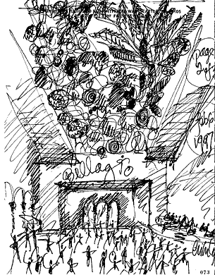
With so many books available on the topic of design, Lauer's Design Basics lays out the process of designing to its most basic, organic and simple process.  When meeting with Steve Wynn, real estate mogul and creator of the Bellagio, Chihuly listened to what Wynn wanted and began with a sketch.....


Exactly what inspired this rich flowerbed in unknown to me, but Chihuly took this inspiration, put pen to paper after thinking about what form the idea would take, and , the sketch above conveys the idea of the form to the client.

The Thinking, the Looking, and now, the Doing....

Production!

Chihuly, a trained interior designer and architect, became interested in the art of glass blowing in the early 1960's.  He was accepted into University of Wisconsin's hot glass program and from there, was at the Rhode Island School of Design, where he established  the glass blowing program and a new generation of renowned artists.  His craft of glass blowing was finely tuned and passed on.
Glass blowing, itself is a very complicated process...


I am fascinated that what once was the earth, mere sand, can become a piece of floating sky, shiny, smooth curves up in heaven......

In addition to the level of skill required to master the medium of glass, Chihuly also utilizes his skills at drawing and painting to plan and execute his installations.  In fact, his acrylic paintings, in their abstract beauty, are used to communicate to his team of talented glass blowers what it is he is looking for in the final product.  It is an essential part of the looking, thinking, planning and doing process that is design....


Chihuly at work...

Honolulu Academy of Arts

As you can see, Chihuly's paintings exhibit the same abstractions of the actual objects of which he is trying to interpret and project to his audience.  Movement of color as well as rudimentary and organic shapes convey one idea, expressed as many.  In the above picture, we see the concept of a vase.  But the variety in which this form takes shape is unique and fresh within every sectioned panel.

His list of projects, exhibits, installations and awards is exhaustive and immense and well worth checking out on the website....

I invite you to go to one of his exhibits and have included a schedule....

2010


  • September 16 – October 16, 2010
    Chihuly 2010
    Marlborough Chelsea, New York, New York

    November 5 – 7, 2010
    Chihuly at SOFA 2010, Litvak Gallery
    SOFA Chicago, Chicago, Illinois

    April 30 – October 31, 2010
    Chihuly at Frederik Meijer Gardens & Sculpture Park: A New EdenFrederik Meijer Garden & Sculpture Park, Grand Rapids, Michigan

    May 9, 2010 – January 2, 2011
    Chihuly at the Frist
    Frist Center for the Visual Arts, Nashville, TennesseeMay 25 – October 31, 2010Chihuly at CheekwoodCheekwood Botanical Garden and Museum of Art, Nashville, Tennessee

    June 6 – October 4, 2010
    Red Reeds at the 2010 International VSA FestivalJohn F. Kennedy Center for the Performing Arts, Washington, D.C.


    December 4, 2009 – December, 2010
    Chihuly at CityCenterThe Gallery, CityCenter, Las Vegas, Nevada


  • Seeing the Earth below us, the sand, turned into floating bouquets in the Sky, is believing.......


    Tuesday, October 5, 2010

    Design 001 and Stone Soup

    We all know the story, ESPECIALLY if you are like me and grew up in the 70's when Marcia Brown's Stone Soup was first published.


    Stone Soup, a story long told around Europe, Africa, and finally, America, is basically a story about making something out of nothing.  Typically, the story starts with a beggar who comes into a village where no one wants to feed him, so he declares that he will make " stone soup"....curiosity gets the best of the townspeople, and bit-by-bit, they add their own contributions of carrots, onions, celery,etc., until the whole town, including the clever beggar, is eating.

    In Marcia Brown's Stone Soup, the American Civil War version, it is 3 soldiers who come into the village and the story is essentially the same: a feast for all out of nothing.

    And thast is exactly what we had today....A feast for all out of nothing.  Dr. Housefield, fearless leader of Design 001 and beyond, challenged us to all bring "stone soup" items: non-food, old, discarded, recycled...whatever.  It just had to be our own ingredients to add to a design challenge soup.

    We arrived at class today, everyone holding their media in hand, and headed to the great outdoors with the assignment of creating a 3-dimensional art project that incorporated all of our team's materials.  The challenge was to look at, collectively, what we had to work with, and see what form took shape.

    Here, my fabulous team's results:


    The ingredients in our stone soup were of delicious varieties: I provided the copper wire, maps, sheet music and frames, and my team members Jenny, Rebeka, Marisa, Ashley, Emily, and Yes brought such treasures as jute, buttons, bottlecaps, construction paper, paint, empty bottles, silly strings, embroidery thread, and a lot of creative energy......

    Just for fun, YOU try the real thing.......

    Ingredients
    • 1 stone, big enough that it won't get lost in the soup (quartz is a good choice because it won't break down in cooking)
    • 1 tbsp. butter or vegetable oil
    • 1 medium onion, chopped
    • 2 celery stalks, trimmed and chopped fine
    • 1 large carrot, cut into coins
    • 3 medium red-skinned potatoes (unpeeled, and cut into halves)
    • 1/2 sweet red pepper, chopped
    • 1 large garlic clove, pressed
    • 6 cups chicken broth (or a combination of broth and water)
    • 1 medium zucchini, diced large
    • 1 medium yellow squash, diced large
    • 1/2 cup corn kernels, fresh or frozen
    • 2 cups cooked tubettini or ditalini, or other soup pasta (optional)
    • Salt and freshly ground black pepper to taste
    • Grated Parmesan cheese
    • Croutons

    Instructions
    1. The first step is for your child to scrub and wash the stone thoroughly. Then, for an extra cleaning, she can drop it in a pot of water to boil while you prepare the rest of the soup together.
    2. In another large pot, melt the butter or heat the oil, then sauté the onion on medium-high for 2 to 4 minutes. Stir in the celery, carrot, potatoes and red pepper, sautéing for 6 to 8 minutes. Add the garlic and sauté for about 30 seconds, then add in the broth. Using a spoon, fish the stone out of the other pot, add it to the soup and bring to a boil. Add the zucchini, squash, corn and pasta, cooking another 8 minutes or until the zucchini is the desired softness. Season to taste with the salt and pepper. Before serving, sprinkle on the cheese and croutons, then ladle--minus the stone--into individual bowls. Serves 6 to 8.